
In this article, you’ll find specific tips on how to create a website for a language school. We will share proven solutions, some of which are very universal, while others are specific only to language schools. The inspiration for this post comes from observing hundreds, or even thousands, of language school websites during various promotional and development activities related to the LangLion platform.
What will you find in this article?
- What do you need to remember when creating a website for a language school?
- Structure of a language school website
- Practical tips on navigation and appearance
- Summary – language school website
What do you need to remember when creating a website for a language school?
Choosing the right domain
Choosing a domain for a language school is an important decision that affects its recognition and professional image online.
The rules for choosing a school’s domain are simple – it should be as short as possible and preferably end with the extension .com. If the school meets the appropriate criteria, you might consider .org.
It’s advisable to avoid less intuitive extensions like .info or .net, which may be less recognizable to users. It’s strongly recommended not to use free domains like prv.uk, as they appear less professional and may inspire less trust.
Professional logo and consistent layout
A professional logo is one of the most important elements of a language school’s image. It should be simple, readable, and easy to remember, as it builds brand recognition along with the school’s name.
Apart from the logo, it is also important to design a cohesive and aesthetically pleasing website. Colors, fonts, and the entire graphic layout should harmonize with each other and create a professional image of the language school.
The website should not be overloaded with information – the most important content, such as the offer, pricing, and registration form, should be easily accessible. Clarity and logical structure make it easier for users to navigate the site and quickly find the information they need.
Check out how to design a good language school logo!
Compliance with web standards
The language school’s website should work seamlessly on various devices – computers, tablets, and especially smartphones, as these are the devices most users access it from. A fully responsive design will ensure that the site looks good and functions well on any screen size.
Another very important element is the page loading speed. If it loads too slowly, users might simply leave. To avoid this, it’s worth optimizing graphics and choosing a good hosting service.
Another crucial aspect is security. The website should have an SSL certificate, meaning it operates on the HTTPS protocol, which protects user data and makes the site appear more trustworthy.
SEO optimization
A language school’s website should be optimized for search engines to attract as many potential clients as possible. SEO optimization of the site can include, among others:
- Header optimization – logical structure of content.
- Keyword optimization – using phrases such as „language school website.”
- Mobile compatibility – responsiveness of the site.
- Internal linking – improves navigation and indexing of the site by Google.
- External linking – builds site authority.
- Meta data – appropriate titles and descriptions for search engines.
- Technical elements (sitemaps, HTTPS protocol) – affect the indexing of the site by search engines.
- Page load speed optimization – image compression, lazy loading, code minification.
- Adding schema.org tags – help search engines better interpret content on the site.
- Blog content optimization – regularly publishing valuable articles with SEO in mind.
- Creating a content marketing strategy – valuable content for users and building authority.
Structure of a language school website
The website should provide complete information in an organized and readable manner. Additionally, navigating the site should be easy and intuitive for the user.
Key elements:
- Homepage
- About us – history, mission, and teaching staff.
- Offer/Courses – detailed information about programs and levels.
- Student reviews – experiences and recommendations.
- Knowledge – educational blog, e-books, and free language learning materials.
- Pricing – information about course and class prices.
- Contact – simplified methods for inquiries.
This is an example of a simple website!
In the menu, you can customize the offer according to your preferences, for example, by dividing it into „individual courses,” „group courses,” or by target groups such as children, teenagers, adults, or companies. You can also add other additional subpages, for instance, „free placement test,” etc.
Practical tips for navigation and appearance
Homepage
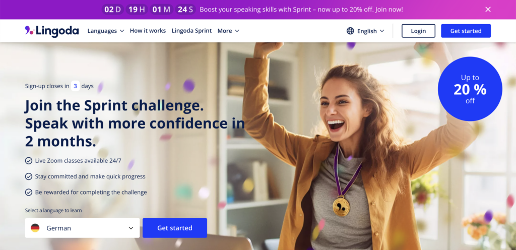
First impressions are crucial – this is where the user decides whether they want to stay on the site longer. The homepage should be clear, encourage action, and clearly show why it’s worth choosing our offer.
This is not the place for long text – what matters is clarity, simple language, and well-placed elements that quickly catch the eye.
What should be included here?
- Bold headlines – they should immediately convey what we offer and what the main benefits are, e.g.,… „Language Learning That Delivers Results!”
- Clear mission and values statement – a few sentences about what sets us apart and why it’s worth trusting us.
- Calls to action (CTA) – e.g., „Enroll in a course!”, „Check our offerings”, „Take a free placement test” – it’s important for the user to immediately know what they can do next.
- Intuitive navigation – a simple and clear menu that allows users to quickly find the information they need, such as course offerings, reviews, or sign-up forms.
- Student reviews and recommendations – also known as social proof. Nothing is more convincing than real stories of people who have already taken the course and are satisfied.
- Clear layout and attractive design – it’s beneficial if the site isn’t overloaded with text, and important information is presented in a clear format. Photos, short videos, or icons can help quickly convey content.
About us page
People like to know who they’re dealing with before deciding to purchase or enroll in a course. Therefore, the „About Us” page should not only tell the school’s story but also build trust and highlight what makes us unique.
It doesn’t have to be a long text – what’s important is that it’s specific and authentic. It’s good if it shows why the school was founded, who runs it, and what values are important to us. However, a language school’s website should always include an „About Us” page!
If you want to create an effective page about your school, read the post how to write an „About Us” page to win over customers!
Offer page
On this page, we can present our products and services in a way that is clear and attractive to customers. It is here that users should find all the key information about our offerings, making it easier for them to decide to enroll in a course.
A well-designed offer page not only presents products and services but also builds trust and increases conversion. It’s worth ensuring intuitive navigation and a clear content structure. It is also important to tailor the language to the audience—the text should be clear, engaging, and encouraging to take action.
Key elements:
- Detailed course descriptions – it’s worth presenting the levels of advancement, course duration, teaching methods, number of participants in a group, and the benefits of learning. You can also add a sample class program so potential students know what to expect.
- Price transparency – clearly presenting course costs and information about possible promotions, discounts, or installment payment options. Hidden fees can discourage clients, so it’s better to opt for full transparency.
- Multimedia – attractive photos, videos of classes, webinars with instructors, or short course snippets can significantly influence the decision of potential students. Visual materials allow a better understanding of the class atmosphere and show what the learning process looks like.
- Student testimonials – nothing works as well as recommendations from satisfied clients. It’s worth including authentic reviews from former and current students, and if possible, add their photos or short video recommendations.
- Price – clearly stated course prices without any hidden costs. An option to compare different course packages can also be added, so users can more easily find a solution tailored to their needs and budget.
- Online enrollment – a simple and intuitive registration form that allows users to quickly express their interest in participating in a course. It’s worth adding a CTA button (e.g., „Enroll Now” or „Check Available Dates”) that will be visible and encourage action.
- Additional materials – providing a free placement test allows users to check their level and better tailor the course to their needs. An online trial lesson can also be offered to help convince undecided clients to choose our offer.
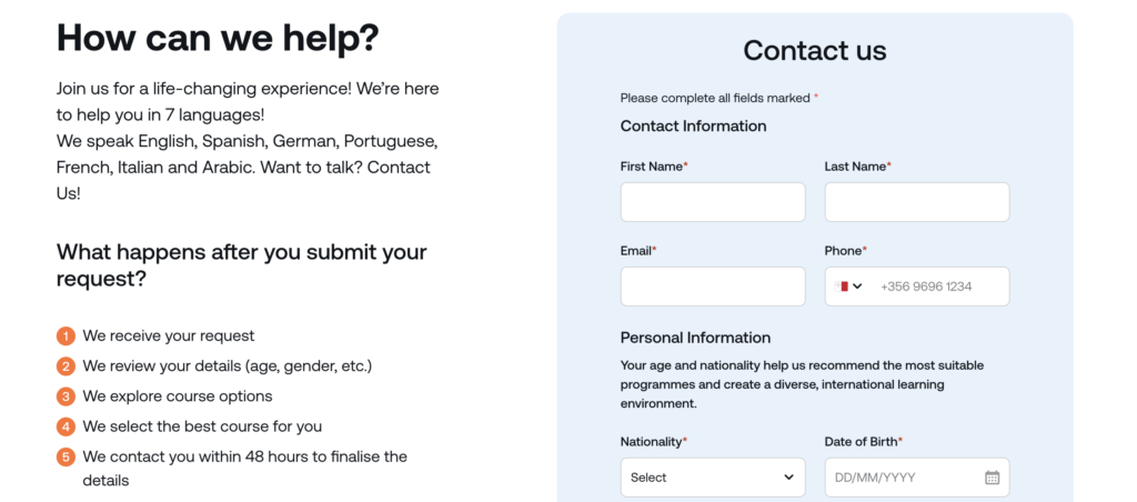
Contact page
The contact page is one of the most important sections on a language school’s website. It should make it as easy as possible for users to contact the school and enroll in a course. It’s crucial that all information is easily accessible and the registration or inquiry process is as simplified as possible.
What should be included here?
- Visible registration forms – the form should be readily available without the need for extensive searching. It should be clear, intuitive, and easy to use.
- No unnecessary fields in the form – the fewer fields there are to fill out, the more likely it is that the user will complete it. It’s sufficient to ask for basic information such as first name, last name, email address, and optionally a phone number.
- Live chat and chatbots – quick contact is essential. It is worth enabling users to ask questions via live chat or an automated chatbot that answers frequently asked questions.
- Visible contact information – the phone number, email address, and exact location of the school should be easy to find. It’s also good to include opening hours.
- Option to schedule a trial lesson – the ability to quickly book a first lesson is an excellent way to encourage users to sign up for a course.
Other key elements
Calls to action (CTA)
On the contact page, it’s beneficial to include clear and specific calls to action, such as „Enroll in a course now!”, „Have questions? Write to us!”, „Schedule a free lesson!” This way, users will know what the next step is.
Privacy policy and terms of service
Every school processes personal data, so it’s important to ensure a transparent policy and privacy terms. Users should have easy access to this information, for example, in the website’s footer.
Social media
It’s a good idea to add links to the school’s profiles on Facebook, Instagram, or YouTube on the contact page. It’s important to show that the school is active and developing, but remember that the website is not a place for informal content. Interesting facts, anecdotes, or funny images are better published on social media platforms where the audience can interact more freely.
Contact information for the school
All crucial details, such as address, phone number, email, and opening hours, should be prominently displayed.
Address information or map
Adding a Google map with the school’s location marked will allow users to quickly check where it is located and how to get there. You can also include public transportation directions or information about available parking spaces.
Website footer
All key information, such as contact details, privacy policy, terms and conditions, and links to social media, can be placed in the footer, which will be visible on every subpage. This ensures users have quick access to these details regardless of where they currently are on the site.
Summary – language school website
Creating a professional website for a language school is an investment in growth and acquiring new clients. It’s essential to focus on aesthetics, intuitive navigation, clear offerings, and effective SEO optimization. If you take care of these aspects, your school will be more visible online.
Do you want to increase your school’s online visibility? Check out how to create a a Google Business Profile and reach more students!