
We are back with the popular ranking of the best language school websites! Some time ago we decided to publish this website ranking separately for individual countries. This time we are taking a look at the websites of language schools from Romania.
When creating this website ranking, we used the same criteria as when rating language schools from Australia and New Zealand. Of course, we took into account the specificities of the Romanian market and the target group of students to whom the offer is addressed. Why are there these websites in our ranking? Read on to find out what makes them special! Perhaps you will get inspired to make some changes on the website of your language school 🤩
What Romanian language schools are there in TOP 10?
10. Lingua Pro
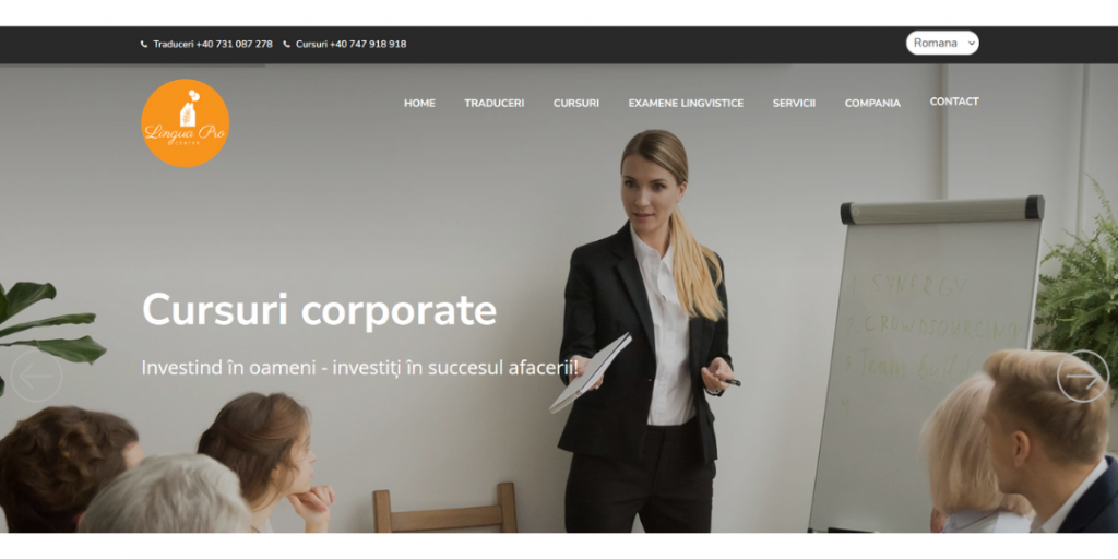
Our website ranking starts at tenth place. Even though the Lingua Pro Language Center takes the last place, it is still a big honor, because we chose among dozens of websites.

High-quality pictures. This makes the website very aesthetic and attractive from the perspective of a potential customer. The website of the Lingua Pro language center is distinguished by its transparency and minimalism.

Responsiveness. In the mobile version, the website does not lose anything, it can still be browsed very comfortably. All the elements are properly arranged and readable, an added plus for interactive elements on the homepage.
9. Twinkle Star
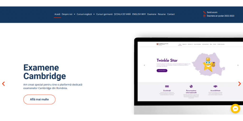
The penultimate place in our website ranking falls to the Twinkle Star language school. We appreciate the design in line with current trends, readability, and interactive elements on the page.

Interactive design. As we scroll the home page, more sections open in an interactive way. Just click to watch the video or scroll to see for example more pictures of teachers.

Newsletter. This is something that distinguishes Twinkle Star. Few language schools run their newsletter, and it is a great tool to stay in touch with customers and inform them about our school’s activities.
8. Lisan
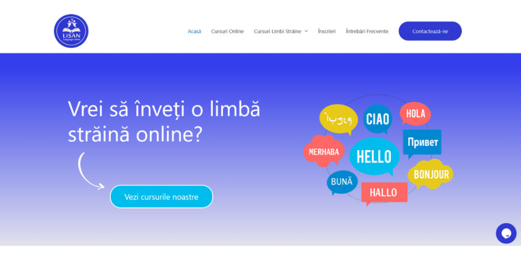
The Lisan language school website is characterized by easy navigation and interactive design. The feedback of the students on the homepage also deserves a mention.

Interactive form and intuitive navigation. Immediately after opening the site, we can click on the button and check the offer. The contact button is also highlighted.

Student reviews. This is one of the most important sections to be included on the website of our language school. Positive reviews significantly increase the chance of interest.
7. Burlington English
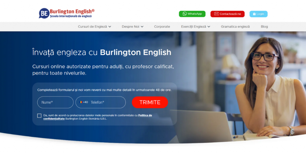
The Burlington English language school is easy to navigate. You can find all the necessary information and read the students’ opinions, so it is ranked seventh.

Student review section. This section definitely deserves to be honored, because the opinions are also presented in the form of short videos, which we really enjoy watching nowadays. Great idea!

Easy navigation. You can see the inspiration of the modern trends – you can find all the most important information on the homepage, just scroll through it. This is a very intuitive and clear solution.
6. Centru limbi straine B.Smart
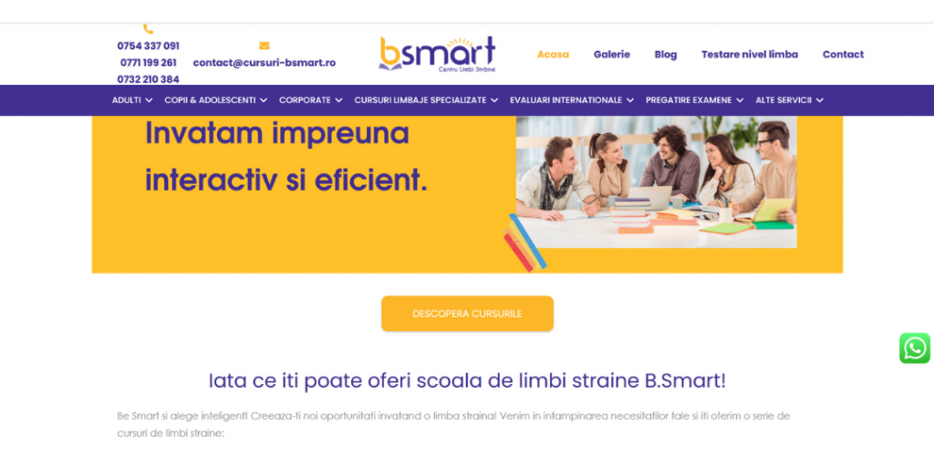
An eye-catching selection of colors, an interesting blog, intuitive navigation, and responsiveness – these are the reasons why the website of the Centru limbi straine B.Smart deserves to be awarded sixth place.

Responsiveness and intuitive navigation. The page loads quickly, both on desktop and on mobile. It is very easy to navigate and you can effortlessly find all the information you need. In addition, phone numbers and the email address are clickable, which significantly speeds up the contact process and makes it more convenient for the potential customer.

Blog with interesting articles. In the case of the language school, blogging has plenty of advantages and it is definitely worth doing it. Students or their parents are looking for different information about learning foreign languages, and thanks to the blog they are more likely to visit our language school website and get interested in the courses we offer. A huge plus for the Centru limbi straine B.Smart.
5. Flying Colours
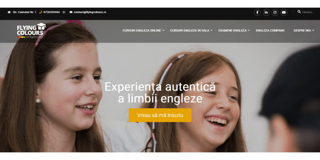
We are about halfway through, time for number five. We decided to award a fifth place to the Flying Colors language school. The website of this language school is coherent, modern, and interactive.

Coherent and modern design. Navigation definitely deserves praise. The website is designed accordingly to the latest trends – when we scroll it, new sections appear. They load quickly, in an interactive way.

High-quality pictures. We really like the section with conference pictures at the bottom of the homepage. Additional activities of the school and placing emphasis on development are viewed positively by the students or their parents.
4. Cambridge Star
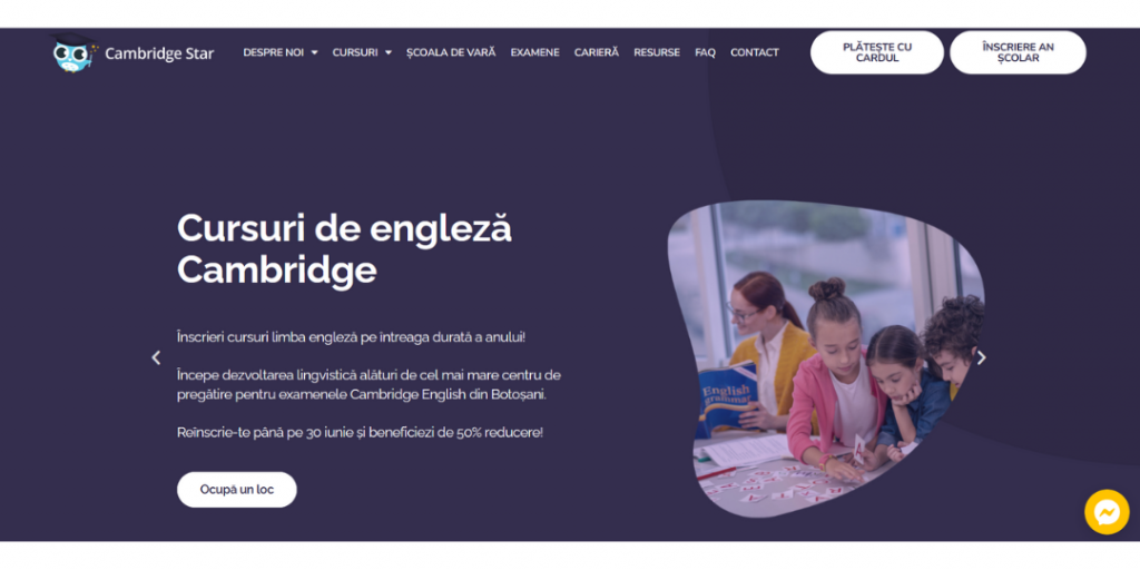
We are approaching the podium! It is often said that there is nothing worse for the athlete than the fourth place, but not in this case. The Cambridge Star language school website definitely deserves a high rank in the TOP 10.

Modern design and consistent graphics. You can see that the website has been created in a thoughtful way and in accordance with current trends. All the sections with key information open when we scroll the page. The information is presented interactively and the layout is coherent, aesthetic, and visually attractive.

Navigation and responsiveness. We have already pointed out that the Cambridge Star website has been designed in a modern way – it is also well-adapted for mobile devices. The information loads quickly, the page is readable and we can easily find what we are looking for (also in the mobile version). A huge plus for that!
3. M&Dorado
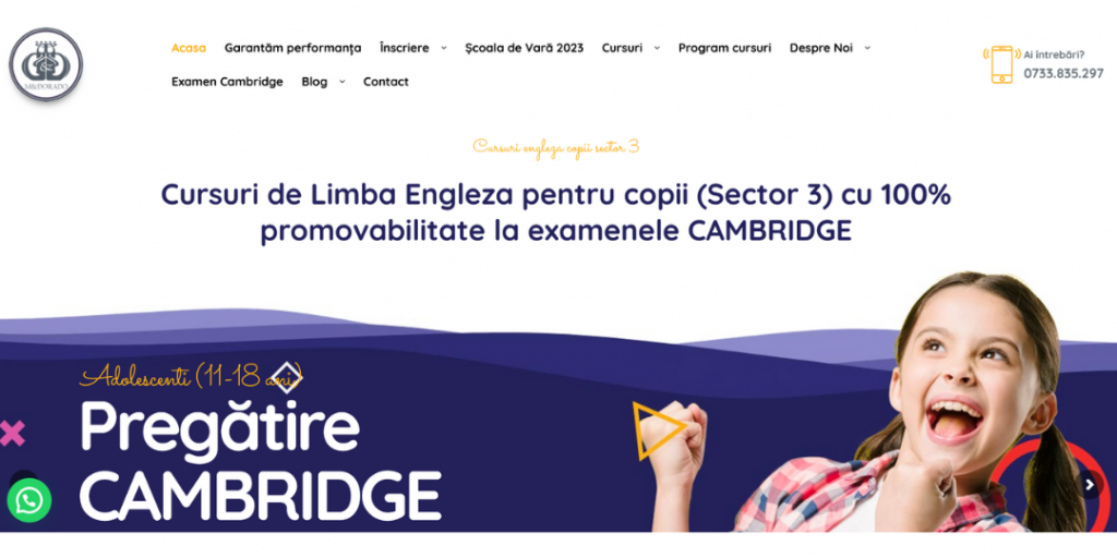
We are starting the podium! It is opened by the M&Dorado Language School. The website is distinguished by its modern design, interactivity, and visual attractiveness.

Easily accessible contact details. We draw attention to this because from the perspective of a potential student this is a very important information. The difficulty in finding contact details can make them lose interest in the offer of our language school. On the M&Dorado website, in the upper right corner, there is a contact number and you can just click on it. We appreciate the convenience!

Responsiveness. Many language schools forget that most of the content is currently viewed on smartphones. And this trend is increasing. That is why it is so important to adjust our website to mobile devices. Here everything works as it should – navigation, menu, loading speed, and the clickable phone number, which we highlighted in the previous point. Using the smartphone, you can call the language school with just a single click.

Section dedicated to teachers. More and more schools are choosing to introduce their teachers on their websites, which we think is a very good decision. This allows the potential student to see who will teach the class and to get to know the teachers before the lessons actually begin. Such information also increases trust in the company. The school ranked third in our ranking and additionally invested in a professional photo shoot, which results in high-quality photographs of teachers on the background of the logo. Nice!
2. EdVenture
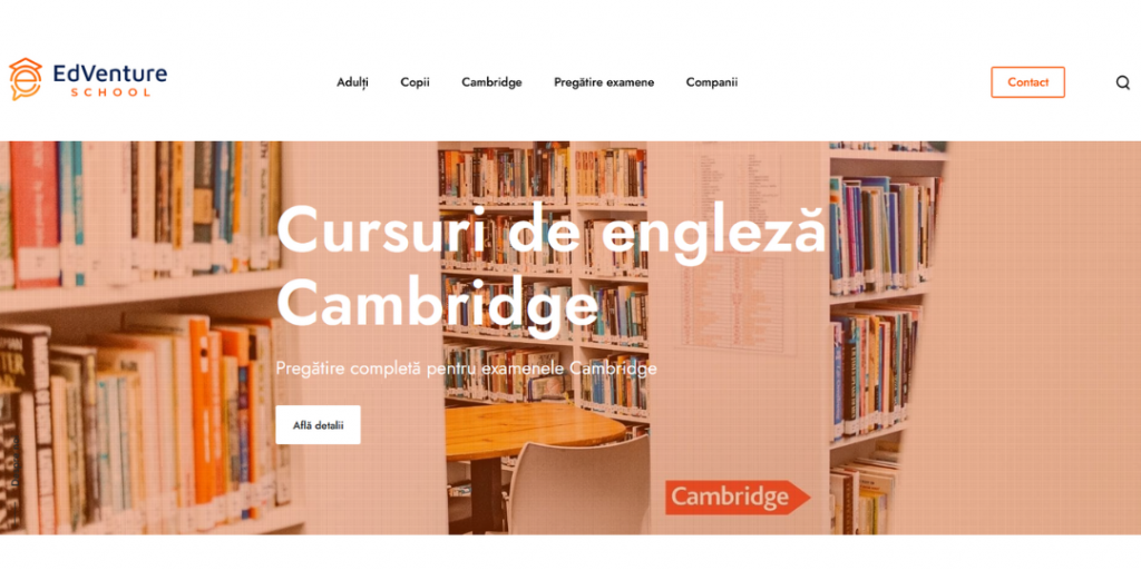
The second place in our ranking goes to the EdVenture language school. Its website has a modern and minimalist design, and the layout of information is very transparent.

High-quality images. We really like the fact that the pictures are chosen thoughtfully. You can see that no picture has been chosen accidentally, everything is very consistent. An additional plus for the simple, but very nice and characteristic logo, which perfectly reflects the minimalism of the entire page and combines well with its color code.

Student review section. When choosing a language school, we browse different offers and we are eager to read what other people think of a particular school. Therefore, including these opinions on the website is a great idea, because the positive impressions of the students are very convincing. On the EdVenture website, there are also the pictures of the students along with their reviews, which we think is a very good idea. It makes the reviews more personalized.

Pictures and description of the facility. Since schools rarely post pictures of their headquarters on their websites, we are all the more appreciative. This is a great move on the part of the language school because it increases trust in the company and its credibility. The website also features a Google business card, along with map, directions, and reviews. Way to go!
1. Novakid
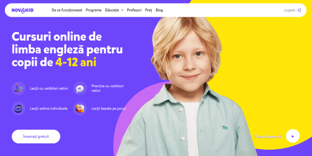
Here is the winner of our webiste ranking, namely the Novakid language school! It wasn’t easy to pick the winner, but we agreed that Novakid stands out from the rest.

Intuitive navigation. Immediately after the page opens, you can see that all the information is at hand so that you can move smoothly from one tab to another. You scroll down the homepage and review the most important information. Everything is well thought out and we are able to find what we are looking for easily.

Consistent and modern graphics. The colors are very distinct and unusual. Together, they make a great, unique combination. You can see that they haven’t been chosen by chance and that everything on the website is consistent. This makes the colors easy to associate with the brand. Similarly, fonts also give the impression of consistency. The entire branding is thoughtful and very modern. In short, good job!

Interesting blog. The fact that the Novakid language school runs its own blog deserves recognition. This does not happen often in language schools, and it is an additional way to reach potential customers, so it is worth doing. Thanks to blog posts, potential students or their parents can learn more about the topics they are interested in.
What do you think of the ranking?
Congrats to all the schools! You can clearly see that they put a lot of work into their websites, making them attractive from the perspective of the student. They definitely deserve an award. We wonder if you agree with us, so feel free to share your thoughts 😃
Interested in the topic of creating a website? Check out 6 trends in website design – this article is a bit archival, because it was published in 2018, but the things mentioned there are timeless. Or maybe you want to find out how to create a good website for a language school? Hope it helps!
If you want to keep up to date with the latest rankings and news, follow us on Facebook and Instagram 🦁💙
