
We are returning to rakings of the best websites of language schools! But this time in a slightly modified form. Since each market abides by its own rules and every country has its own customs, we decided to make separate rankings for each region. This will allow each of you to refer to the ranking that might be of interest to you. We are starting off with Australia and New Zealand!
After several deliberations, stormy discussions and having viewed numerous websites, we managed to select the ranking winners, who in our opinion deserve particular recognition. Do you want to know who attracted our particular attention? What criteria we have applied in our subjective assessment and why these – and not other – websites found their way into our ranking? You must absolutely continue reading our article.
What should we take into account while creating a good website?
First of all, you need to remember that the website is your showcase. So it is worthwhile to examine your conscience and answer several questions for yourselves:
1.Is my website coherent and transparent, or perhaps it rather resembles a notice board, where we have to view all of them to find the one that is of interest to us?
Besides the first visual impression, a potential client entering your website evaluates first of all how easy and fast they can find the piece of information that is of interest to them. In the case of language schools, the most important pieces of information include: the price list, types of courses, opinions and contact data. In the era when time plays an enormous role, if we fail to reach the desired information efficiently, we simply move on to the competitor’s website.
2. Is my website responsive?
Perhaps the greatest sin of a majority of websites is the fact that even if they delight when seen in browsers, their viewing on mobile devices is a real challenge. Incorrectly displayed menus or their absence, pop-up windows that cover half of the screen or poorly scaled photos, are just some of the offenses related to unresponsiveness.
3. When was my website last time refreshed?
There are many good websites with truly great potential, but the last time they were attractive for visitors was in 2008. You do not have to change the entire concept but it is worthwhile to follow current trends to know what is most attractive for your customers at a given time. If you fail to do it, your competition will and you will pale in comparison.
If you want us to refresh the topic of creating websites in a separate post, you must absolutely let us know in the comments. And now the time for the ranking!
RANKING 2019
We had many robust candidates for the first place 🙂 And we were unable to choose just one because each of them stands up distinctly against other websites. Therefore, we decided to give the first place to 2 schools ex aequo! Here they are:
ELSIS – English Language School
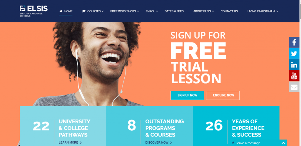
This was the website of ELSIS school that we hailed as the most professional one. This is what we like the website of the English Language School in Sydney most for:

First of all for responsiveness! Perhaps the greatest sin of a majority of language schools is the fact they forget that virtually 90% of all content is presently viewed on smartphones. In this regard, ELSIS clearly stands out against the competition. Navigation, menu, short loading times and transparency of the content – superb!

Top-quality photos and coherent graphic design. We really liked a lot the departure from stock photos and the fact they invested in a professional photoshoot of course participants! Nothing is placed at the website accidentally and everything is very well thought-out. Additional plus for simple, but nice and characteristic logo.

Intuitive navigation. When you view the website, it is immediately clear that all pieces of information are at your fingertips and you can move smoothly between tabs. At the same time, a good organization is maintained and there is no information overload. Bravo!

A professional brochure with all necessary pieces of information is available for download. Extremely useful and easy on the eye.
So in a nutshell: WOW! We are truly impressed!
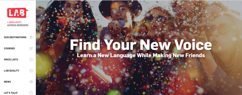
„So much more than a language school” – it would seem this motto is typical for a majority of language schools in Australia. But in our opinion, the LAB is a perfect reflection of the essence of this message. The school has branches in three destinations, including also in Canada, but as the ranking concerns Australia, we are going to focus on the tab depicting the school in Melbourne. What captivated us at the website of LAB:

Landing page! You can only make the first impression once and LAB seems to be aware of that perfectly. Top-quality photos matched to the offbeat motto make us want to stay on the website longer and check what else the school has on offer. Kudos for placement on the landing page of such tabs as: „Talk to an Advisor” and „Need more info”. Learning a language in Australia is not only a course but very frequently also accommodation and becoming familiar with local culture. It is good to know where to derive all pieces of information on that topic from still before arrival.

A professional video introducing LAB Melbourne – video is the most attractive visual message carrier; materials of this type reach the people interested in signing up for a course the fastest and the best. Bravo!

Responsiveness! Also, in this case, our hats are off to the school for the mobile version of the website. We have absolutely no reservations.

Perfectly edited content. Neither too much, nor too little. All pieces of information on the website are a fast and pleasant read. Kudos for transparency and intuitiveness, owing to which one knows instantly where to look for the needed pieces of information.
Well done! Congratulations!
ELC – English Language Company
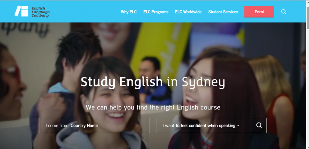
Another website that won our hearts. English Language Company definitely stands out with its off-beat nature and solutions we have not seen on other websites before. This is what grabbed our attention most:

A browser on the landing page – congratulations on the neat idea because this solution perfectly meets the needs of the language school market in Australia! What makes the ELC browser stand out? Well, once you have selected your nationality and type, of course, you want to attend, detailed information is displayed about:
- the type of visa you are going to need; what it authorizes you for and what period it is granted for,
- the courses that match your profile,
- detailed information related to the price and duration of the selected course,
- information concerning life in Australia if we opt for a longer stay.

Original calendar of ELC events – the graphic layout and the information provided are very well matched and not only make the calendar useful in terms of planning events but also please the eye owing to well-chosen thematic photos. Plus for the option to share the events at Facebook and Twitter!
Besides, you will find at the website everything that should make a professional website of a language school to stand out, namely:
- video materials on the landing page,
- a carefully prepared information brochure for download,
- super interesting and originally designed „Why ELC” tab. We are awarding an additional mention for this.
And first of all the website is responsive. Keep up the good work!
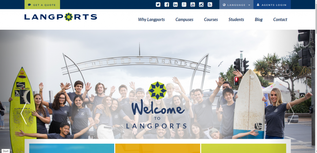
Another school that resigned from stock photos available to anyone and invested in a photoshoot with course participants. This was a good decision! Owing to it, the website does not look artificial and is more credible. Additional plus for the fact that most photos and video materials are of good quality. We recommend such a measure to be used across all tabs. This is a detail that will make the website look more transparent and professional. The thing we would like to applaud the school’s website most for is the virtual tour available for all three existing branches. We are all the more impressed because this option is very rarely available while being extremely important for students who often come from the other side of the world. Kudos for the mobile version and regularly updated blog!
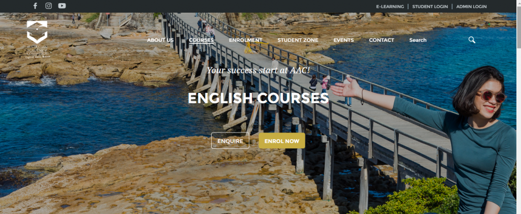
Although not a typical language school but a Language Centre belonging to the Australian Academy of Commerce, since the website of the AAC stands out against others, we decided to place it in our ranking. Why? First of all for professionalism. All pieces of information, tabs, and materials available for download on the website are designed down to the finest detail, both in terms of information offered and in the visual aspect. A perfect source of inspiration, first of all, because of:
- perfectly designed information brochure where one can find absolutely everything. Lots of relevant pieces of information, transparency of the content and perfectly executed graphics. Superb!
- opinions of students in the form of video materials – a real home run! Owing to this, a potential student may identify with the school easier and feel the atmosphere present there.
We like it a lot 🙂
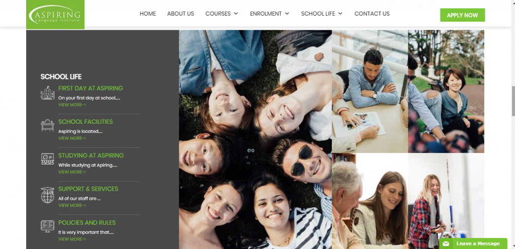
The website of the Aspiring Language Institute attracted our attention first of all because it relies on customized graphic design. It is a nice surprise that on the landing page in the first place we can see a carefully and professionally made video presenting in greater detail Auckland, the city where the school is located. Moving slightly below, we can find a video material where we learn more about the history of the school and its daily life. We are happy to see more and more schools relying on their websites on photos and videos presenting real students and teachers, who are an important part of the school’s image. It would be good to utilize the website’s space better and strike a better balance between content and graphic elements because sometimes one can be under an impression that some tabs are slightly empty.
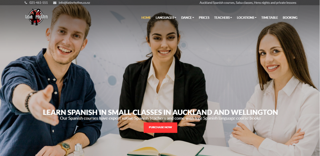
Another website that deserves recognition, one that quite untypically combines language courses with dancing courses. An interesting idea per se, but we are going to focus on the part of the website related to the language school. The first advantage is the price list, which you do not have to search for. In a majority of schools in Australia and New Zealand, price lists are flexible and depend on several factors. At the Latin Rhythm website, we can see straight away how much a course costs and what is included in the price. Another plus for the tab introducing the teachers. Besides the qualifications, we propose also to post less official pieces of information about them. This will help in warming up their image and strike a less official tone.
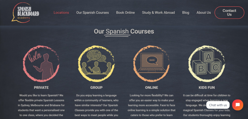
A very interesting idea to use a notice board as the main motive of the website’s visual identification. It is worthwhile to consider using more involving and more distinct graphic elements on the landing page. We like such tabs as „What people say about us” and „Why Learn Spanish”. It is clear they are well designed and thought out 🙂 The same concerns easily accessible tabs containing prices for courses, which redirect us to the booking form. Another plus for the „About Us” tab and presentation of the staff. Just as was the case of the previously mentioned school, we recommend a presentation of the history in at least a few sentences and some more information about teachers. Students are certain to appreciate this!
We congratulate cordially all schools. It is clear a lot of work went into their creation and each of them stands out against others in its own special way.

If you want to be kept updated on subsequent rankings and new posts on our blog, follow us at Facebook @langlion and at Instagram @langlion_platform. You won’t regret it!
