An average lifespan of a website is approximately two years. Which by no means implies that after elapse of such a period we are forced to create a completely new site. It all depends mainly on whether the newest standards and trends were accounted for in the website’s design and deployment. In today’s entry, I would like to discuss the most interesting elements, which in my opinion will dominate the websites in 2018.
2018 is not going to bring revolutions on par with withdrawal from Flash technology or emergence of – probably known already to everyone – Responsive Web Design. Which does not mean that nothing interesting is going to happen? However, it is characteristic of trends that they are not coherent with each other and we should always filter everything out through our feeling of aesthetics and good taste. As Karl Lagerfeld once said, “Trendy is the last stage before tacky”.
1. Minimalism
If we were to believe magazines of Focus type, an average human assimilates approximately 34 gigabytes of data daily. Whether this is a real figure or not, you will certainly agree that the volume of stimuli in our daily lives is too high. And this is why we increasingly appreciate simplicity and solutions that are close to the Scandinavian vision of reality. Then why we approach quite differently our websites, which continue to try to attack visitors with a volume of information that is bound to give them at least a massive headache.
Luckily, there is nothing to fear. Out potential customers will definitely not encounter them. Less is more. Light pages, a few quantity of elements, number of colours and font types limited to the absolute minimum have been a standard already for some time now. And although some following bullets on this list will introduce elements contradicting the above statement, this is only because there is no single correct way.
2. Unique photos and graphics
Now I hear you say: “what’s new about it?”. And you are definitely right. This has been a much – colloquially speaking – belaboured topic for a long time. And at our webinars and in articles we also encourage everyone to show at websites what is natural and genuine. Photographs of your teachers and rooms, even if not as rounded, polished up and professional, will definitely work better than artificial stock images. And if you keep glancing at bullet 1, then it is worthwhile to replace those photos with dedicated graphics or geometric shapes, which are a perfect match for the minimalistic trend.
3. Cinemagraph
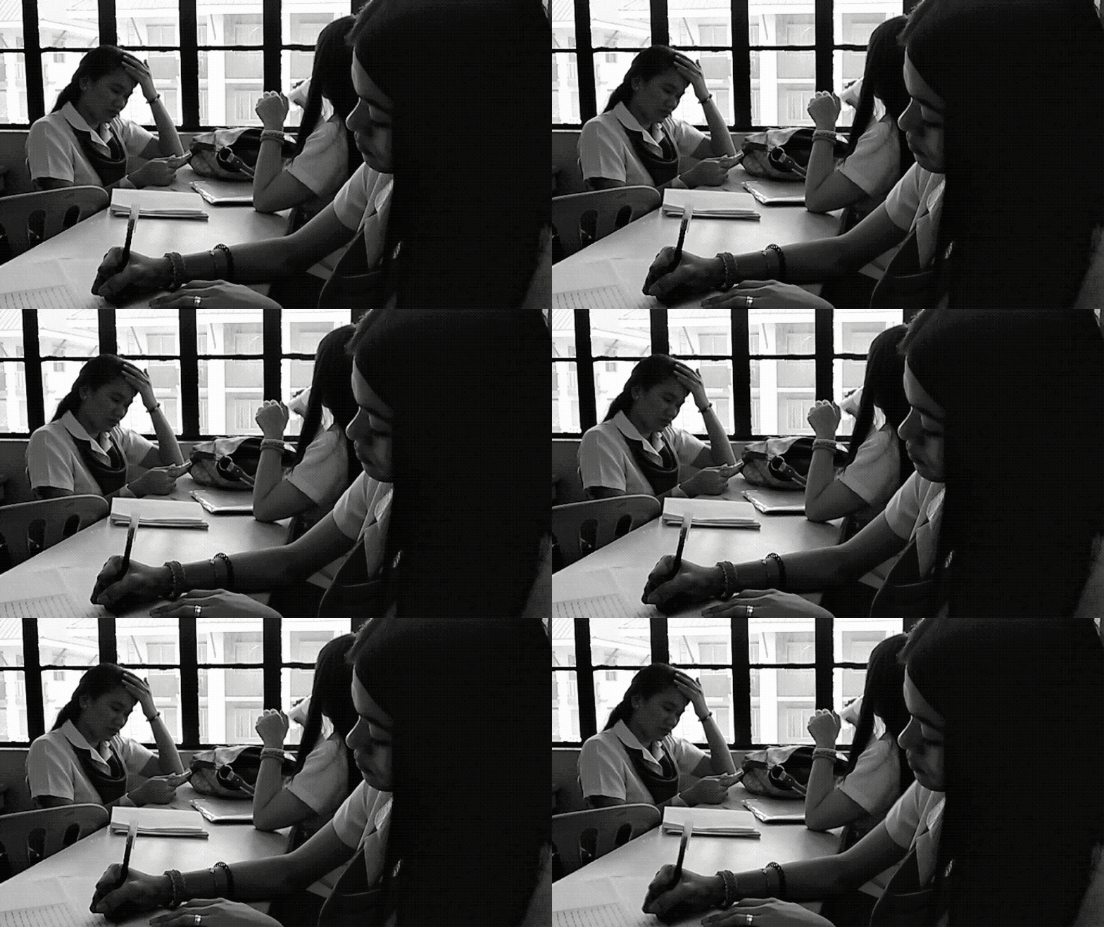
Is minimalism the only right concept? No, it isn’t. It is just a proposal that is worthwhile to be considered. The other pole is equally interesting, and pages filled with animations can be equally exciting solutions. Bullet 3 introduces a certain kind of compromise. And the cinematograph is exactly such a compromise. And once again there is nothing truly innovative about it because those are just old, good GIFs. However, in this case, we do not want them to replace short video footages, but only lend additional climate to photographs by adding some delicate motion. And then we want to use them as the background of our page.
 źródło https://www.pinterest.com/
 źródło https://therosheenaway.wordpress.com/2014/07/04/cinemagraph-photos-at-school/
 |
If you want to learn how to create cinemagraph, I recommend watching this video: How to make your pictures COME TO LIFE using a CINEMAGRAPH |
4. Explainer/Persuader Videos
Those who think a compromise is never an optimal solution, will certainly like bullet 4. Although on the other hand, if our entire website is built around video then, in my opinion we can by all means speak of minimalism. However, in the case of a language school, this will not be so-called „explainer”, because everyone knows what a language school is about. A persuader video will aim to present the school and persuade a potential customer that choosing it will be the right decision. As part of the inspiration, I am encouraging you to become familiar with fantastic deployments of a Polish company named Clipatize.
5. Microinteractions
Non-invasive, delicate animations that do not stand out aggressively against other elements of a website can encourage users effectively to undertake specific actions or draw their attention to the areas we have selected. Buttons that change their appearance when we roll a mouse over them, or gently enlarging Call To Action elements. Those are all details, but as they say: the devil is in detail. And those are details that eventually make the difference.
6. The end of a landing page as we know it
In the times of separate landing pages dedicated to each marketing action, a landing page definitely loses in importance, and it is our objective to direct potential customers to the place where they will find content best matched to their needs. Yes, this all leads us again to reflections on personas, also called buyer personas. The possibility to target the advertising and consequently also the content effectively is related to one more interesting concept, namely that of Age Responsive Design.
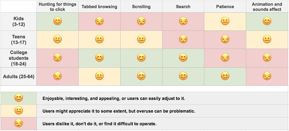
Matching a website to the age of users visiting it. Different colours, font types and size, a different layout of the elements for school-age people and a completely different one for their parents. This sounds slightly cosmic, even more so because in cases other than traffic from ads targeted at a specific age group, guessing the users’ age in real time is not possible (although Google Analytics API provides an opportunity to check in real time such pieces of information as for example the duration of a visitor whether a user has visited our website for the first time). However, Age Responsive Design is a trend worthwhile to remember.
Why? Just look at the graphics below.

—
I wonder which of those trends are best matched to your tastes. Or perhaps you are already using some of those elements at the websites of your schools? Share this information with us, at the same time applying in a way for the next edition of the ranking of language schools’ websites.

