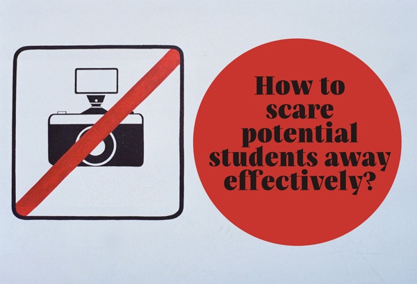
Even the most creative text does not attract a customer as effectively as a visual image, whether you buy photos from chargeable sites or you use royalty-free ones. There are photographs-traps lurking everywhere; ones that may discourage potential students from joining your school. What makes photos good or bad? See what you should eschew most and download a pack of free photos.
Leaflets, advertising mailings, the website are not the only places where good quality photographs are useful. But there is more to that than just high resolution. Remember that something fashionable five years ago will not necessarily work today. So take a look at seven categories of bad and good photos and download a pack of images to be used – and fear not – those are safe and encouraging ones.
1. Teachers
You sure have at your website a folder with photos of your team. Of course the best idea is to place real photos of your school’s teachers. Remember- they must be natural and encourage potential students to enrol. A neat idea is to take photos during lessons.
 |
 |
 |
 |
2. Joy
A language course is good when students are happy. Use photos of smiling students to promote your school but remember to keep them natural. You have to admit that the first photo is frightening instead of encouraging.
 |
 |
 |
 |
3. Learning
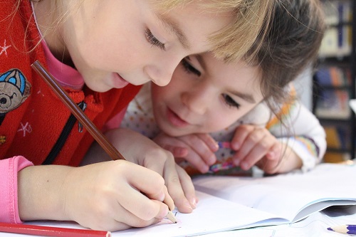
A language school is surely associated inseparably with learning, so whenever you advertise a language school avoid elements pasted in the photographs (like flying books in this example). You had better use a photograph emanating with curiosity of the world and willingness to absorb new knowledge.
 |
 |
 |
 |
4. Language camp
It is best to use photos from previous camps showing what you have to offer: sightseeing, making friends – besides learning of course.
 |
 |
 |
 |
5. New technologies
Working at the computer is not a trivial challenge, but an even greater one is showing that the school uses new technologies. If you use an interactive board during lessons or you have the e-gradebook, try to emphasize this at your website.
 |
 |
 |
 |
6. Inscriptions
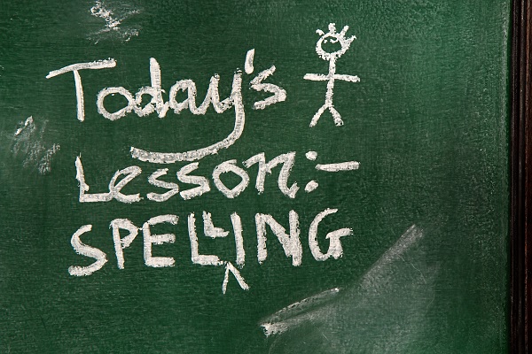
Beware of downloading photos of a board with an inscription obviously made in a graphic application. If you opt to do so, hire a professional graphic artist. Photos of a board where someone really wrote something using chalk will work best. The same advice concerns writing on sheets of paper.
 |
 |
 |
 |
7. Trainings
If you specialise in trainings, organisation of meetings for parents or workshops for students, make sure to invite them properly. Use photos from previous meetings or find equally natural ones.
 |
 |
 |
 |
When analysing the style of each good example, one can identify several common features:
- they are natural,
- no redundant extras,
- they emanate with energy,
- positive approach,
- real settings.
Gift!
You may download a pack of 20 photos for your use. Those photographs have the CCo licence, which permits free use without the need to reference the authors.
[l2g]Download[/l2g]
