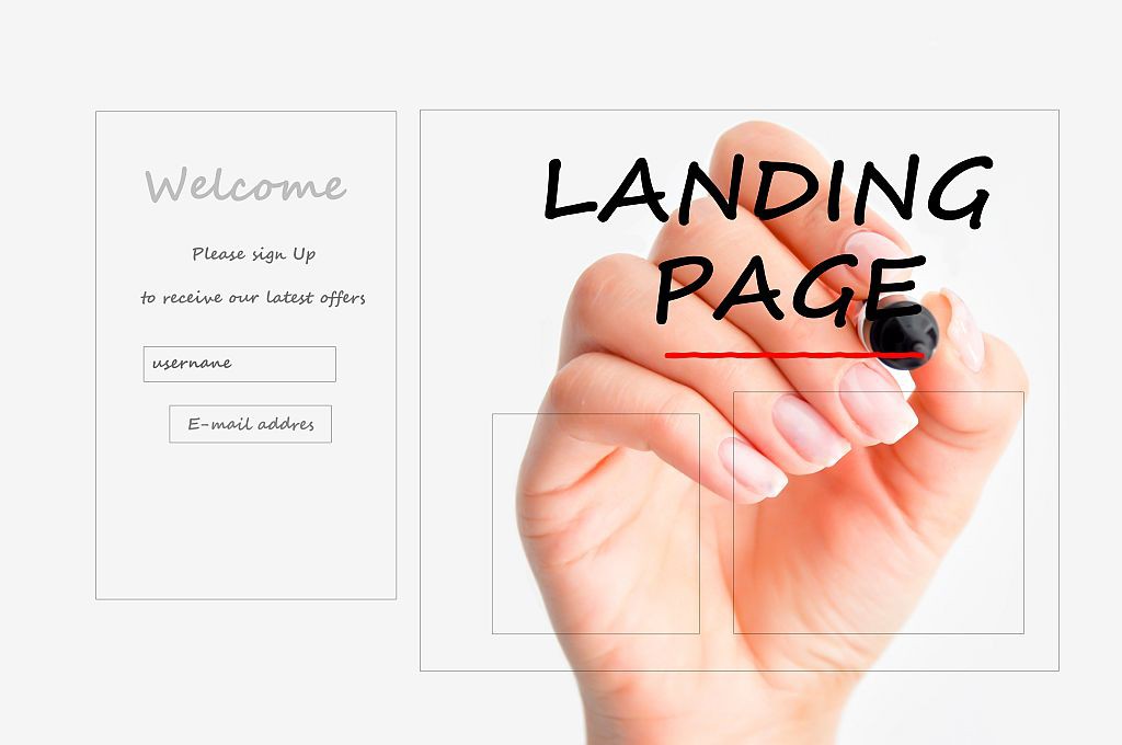
Landing pages are more and more often talked about. What are they? Why build them? Can your language school use them? How? Check out what rules you should use to achieve the intended promotional and advertising goals.
What are landing pages?
A landing page is something like a “destination page”. It is a website that opens e.g. upon clicking on an ad. It is created to provide information to clients in a simple and clear way. This may be about promotion, marketing of a new product, presentation of a teaching method or announcement of a new course to be introduced in a language school. The main tasks of a landing page are as follows: to present the benefits a client will obtain by opting for your offer and to encourage a certain action, e.g. purchase, filling in of a contact form, signing up for a newsletter etc.
A landing page has a header directly referring to an ad or visual identification of the school. Additionally, the header aims to introduce a client to the offer’s content.
It is best to present the content using the language of benefits with the use of visual elements making it is easy to cotton on the topic. It is best to bulletize them and make each refer to major benefits a client will obtain by choosing the company’s services.
The content of the header and the bulletized values are important elements of a landing page, but the most important of them all is the call to action – CTA – button. It encourages to act. After clicking on the link, the customers will finalize the action, that is – depending on your needs – they will use the promotion, provide their e-mail addresses, submit an application or register at a specific online portal.
So make sure the button is well visible, stands out against the background with its size or colour and encourages to be clicked. To improve company’ credibility, it is worthwhile placing several recommendations of your customers at the bottom of the page. Also, do not forget about the footer with contact data and links to the Social Media channels you run, e.g. Facebook, Twitter, Linkedin or Instagram.
A landing page and advertising for language schools
A landing page is an advertising tool used by companies of various activity profiles. You wonder how your language school can benefit from it? There are many applications for landing pages, or rather their number is infinite 🙂 there can as many ideas as there are people.
Owing to landing pages we can encourage potential students to take advantage of promotions or sign up for a course. A landing page is made for one, pre-defined purpose so when you opt for such an advertising form, it is better not to place too many keywords. If you offer promotion for business courses, do not write about courses for kids here 🙂 Chaos, mixture of various threads and the necessity to search a piece of info among many others , not necessarily very interesting from customers’ perspective, can discourage them from using your offer.
For example, if the CTA button is to result in submission of an application for enrolment in a course, it is best to present the assets of the school, namely – for example – a teaching method, cooperation with experienced teachers or modern teaching aids. It is worthwhile to bulletize the school’s benefits and competitive advantages, for example an attractive price, the option to pay in instalment or a discount for textbooks.
When placing info at the page we must remember to use the inverted pyramid method – the most important ones should be placed in the beginning of the bulletized content because they attract the greatest attention of page visitors.
 |
If you want to see how those elements may look like in practice, visit one of our landing pages (I need to give you a heads-up: it’s in Polish). |
An effective way to attract students in affordable price
A landing page enriches the pursued marketing activities. It can effectively contribute to increased interest in schools’ offer among potential students. Well-designed content will help better convert the effects of the promotional campaign. So try this method. If you have a graphic artist in your team, ask them for help in building your first landing page.
You can also try to create a landing page on your own. You will find online generators allowing you to build the landing pages even in responsive version (that is one automatically adjusting to any mobile device, e.g. a smartphone or a tablet). Such generators can be tested for free. Start versions allow for about 2 weeks of free trial.
In that period the generator will let you create a sample landing page, but if you decide to use the generator after the end of the trial period you will have to pay a fee. Those are relatively small amounts, particularly if you plan to create pages of that type often.
The beginnings of the use of such generators will entail some difficulties – you will need to dig into the topic, learn the specifics of the creation of such pages. Luckily this is not the proverbial “rocket science”. Generators are built in such a way that they let you arrange quite intuitively the page elements like building blocks – you drag them with a single mouse movement 🙂 For a start, you can check Instapage.
Have you ever created a landing page for your school?
Did it bring about any effects?
Or perhaps you took advantage of an offer advertised through a landing page?
Share your own experiences with us.

