
A logo is a key element of the image for any brand, including a language school. It is not just a symbol that adorns your marketing materials, but also a tool that builds recognition and trust. How do you design a logo that will capture attention and be memorable? Discover 8 proven principles that will help you create the perfect logo for your language school.
What will you find in this article?
- What is a logo?
- Language school logo – why is it so important?
- Logo vs. logotype
- 8 principles of designing a good language school logo
- What to consider when designing a logo?
- How to check if your logo is well-designed?
- Summary – language school logo
What is a logo?
A logo is a graphic symbol or sign that represents a brand, company, or organization. It serves as a visual reflection of your language school’s identity and is one of the most crucial elements in building its recognizability.
A logo should be unmistakably associated with your brand, memorable, and foster a sense of trust – just like the iconic three stripes of Adidas or the distinctive mermaid of the Starbucks logo.
Language school logo – why is it so important?
A logo is the first point of contact a client has with your brand. It appears on your website, business cards, promotional materials, and social media, alongside your school’s name. A good logo should reflect the character of your school, inspire trust, and be easy to remember. This is an investment that pays off over the years by building a cohesive and professional image.
Want to learn about an equally important element of brand building as a logo? Check out our post: the perfect name for a language school – 7 principles you should know!
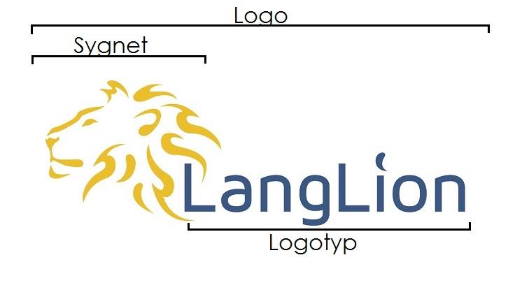
Logo vs. Logotype
Let’s start with the basics – the example below illustrates the difference between a logo and a logotype. Your language school’s logo doesn’t have to include a graphic mark (emblem) but can be enhanced with a slogan, also known as a tagline.
8 principles of designing a good language school logo
1. Simplicity is key to success
The best logotypes are simple and minimalist. Focus on readability and avoid an excessive number of graphic elements. Simplicity makes the logo easier to remember and more versatile.
An example could be Lingua Viva and their logo in its new version.
| Previous | Current |
 |  |
2. Uniqueness and originality
A logo should stand out from the competition. Avoid common symbols like flags or books unless you give them a unique character. Your logotype should be one of a kind.
3. Symbolism that matters
A good design is not just about aesthetics, but also about meaning. Use symbols that relate to the mission of your language school, such as a globe symbolizing foreign language learning or wings representing development.
A great example is the British Council logo, which uses the image of a globe (a symbol of globalization and language learning) to symbolize openness and international cooperation. The Audi logo, which features four overlapping rings, symbolizes collaboration, durability, and the merging of four founding companies into one organization.
4. Typography tailored to the brand
Choosing the right font is as important as symbolism. Consider whether your school is better suited to modern sans-serif typography or a more classic and elegant serif font.
5. Colors that speak about your brand
Colors have a huge impact on emotions and how your audience perceives your brand. Choose a color palette that reflects your school’s values – for example, trust and professionalism (shades of blue) or energy and creativity (red and yellow).
If we think of „Coca-Cola,” the color red instantly comes to mind. When we think of „McDonald’s,” we immediately see yellow arches. That’s how a well-chosen logo should work – the colors must be so strongly associated with your brand that customers immediately recognize them.
6. Readability on every medium
The logo must look good both on a computer screen and on a business card or banner. Ensure that it is readable in various sizes and on different backgrounds.
 | |
7. Versatility and timelessness
Avoid elements that are only trendy for a short time. The logo should remain current for many years and not require frequent changes. Opt for classic solutions that will stand the test of time.

8. Test and gather feedback
Before you make a final decision on the logo, test different versions and ask for feedback from others. A fresh perspective will help you identify elements that need improvement.
What to consider when designing a logo?
Designing a logo is a process that requires thoughtfulness and consideration of key aspects related to your brand. Here are the 3 most important questions to answer before starting work on the logo.
What role should the logo play?
A logo is the visual business card of your language school. Consider what emotions and associations it should evoke. Do you want it to symbolize modernity and dynamism? Or do you prefer to emphasize tradition and professionalism? A language school is a place of learning, development, and inspiration – your logo should fully reflect these values and be consistent with the character of your school.
Who are your audience?
The most important element in designing a logo is understanding who you are targeting your offer towards. A logo for a school offering courses for children will be more colorful and playful, while a school providing classes for companies will focus on elegance and professionalism.
Consider the demographic characteristics of your clients – their age, interests, and needs. Use previously developed personas to better tailor the design to your target group.
What kind of logo does the competition have?
To stand out, your logo must be unique. Avoid inspirations that border on copying existing designs. Research which colors, symbols, and styles dominate in your competitors’ logos, and then create something entirely different.
This way, your school will become more recognizable and memorable to potential clients. Remember, uniqueness builds competitive advantage.

How to check if your logo is well-designed?
Evaluating the quality of your logo is a crucial step that ensures it fulfills its purpose. Here are two proven methods to verify the effectiveness of your logo.
Print your logo in an 8.5×11 cm format and show it to several people who have never seen it before. Show the logo for a few seconds, then ask them what it reminds them of and whom they think your school might teach. Do they describe it in a way that aligns with your intentions? If so – congratulations, your logo is doing its job! If not, it’s a sign that it’s worth reconsidering its elements, such as colors, shapes, or style.
Print your logo along with eight other logos of similar size. Show this group to random people for several seconds, then ask them to list as many remembered designs as possible. Was your logo among those remembered? If so, it means it is distinctive and stands out from the others.
Summary – a good logo of a language school
A good logo is more than aesthetics – it’s a tool for building the image of your language school. Applying the above principles will help you create a design that differentiates your brand and makes a lasting impression on potential students.
Want to learn more about building the image of a language school? Check out our post: how to create a visual identity for a language school!