![]()
A logo is the basic element of visual identification, owing to which customers will recognize your language school. Therefore it is so important for the logo to be not only neat and nicely designed, but also to reflect the nature of your activities. So what should it look like?
What should we pay attention to?
3 most important questions you need to answer even before starting to design your own logo:
 |
What role is to be played by the logo? |
First of all reflect on what task is to be fulfilled by the logo of your school. What associations it is supposed to bring, what it is will be linked to? A language school is a place for learning, development, inspiration. The logo should reflect the features and style of your school.
|
Who are your recipients? |
Perhaps the most valuable element of logo building is comprised by an answer to the question of who do you target your offer at? The logo of a school offering courses for children will look like differently from the logo of a school offering business courses.
Here you should analyse in detail the demographic features of your customers. Here personas developed earlier can come to the rescue. See the article on how to build them.
|
What are the logos of competitors? |
A unique logo is something that can make your language school stand out. Beware of “conglomerating” it out of already existing designs. Take a look at the biggest rivals – gather information on what elements, colours are used by them most frequently and try to distinguish yourself.
 |
Useful links: If you need inspiration, check the newest designs created by companies from all over the world. It suffices if you enter “language”, “school” or search your sector. |
Remember that your logo does not necessarily need to have a graphic sign, or an emblem, and additionally you can use in the logo the slogan of your language school (so-called tagline). It is a good idea to check out what experts think about your logo – so it is worthwhile to place yours there and wait for opinions.
8 rules for designing a good language school logo
-
Simplicity
Remember that a logo is a symbol, so creating fanciful illustrations combined with colourful logo lettering is not a good idea. First, the result will be unaesthetic, and second – difficult to remember.
A good logo does not require a lot, so get rid in the logo of anything that is not absolutely necessary.
 |
|
-
Legibility
In no case you can afford a situation where a recipient seeing your logo wonders what the name of the language school is.
Additionally, you need to remember that the logo will be used in many ways, in various formats and sizes, so it is so important for each element of your design to be legible. You had better test your logo by making it smaller or reversing colours.
A logo for correction:
 |
Good examples:
 |
|
-
Recognisability
Think whether a customer will be able to recall the logo of your school. It is important for a customer to remember your logo to such a degree that they have no doubts whether there was a bus or just the British flag there.
| |
-
Uniqueness and freshness
Remember that your logo should not repeat well-worn patterns, for example: a language school = the flag of the United Kingdom / a red bus. Your logo does not need to be verbatim, i.e. it can refer more to the name than to the offer.
 |
-
Timelessness and modernity
I don’t know if you know that trends in logo designing change every year (see the current ones: ). So if you feel that your logo has not been refreshed for a long time, perhaps the time has come for a small facelift?
| Previous one | Current one |
 |
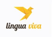 |
Lingua Viva school from Poland underwent a very positive change; in its visual identification it maintained the name and colour code, but breathed fresh air into the logo by using new typography and emblem.
It is not easy to create a timeless logo, which will only need slight modifications across years. However, there are examples of brands that have been recognisable by the same symbols for many dozens of years.
-
Proportionality
A logo looks good if it has the right proportions and is symmetric. In the case of the logo of Twitter we are dealing with the so-called “golden section”, which allows us to create an aesthetic composition using proper proportions.

-
Functionality
An important issue is to make the logo look correctly in various formats and sizes. Make sure you have files both in vector formats: ai, eps, svg, cdr (for printing) and raster ones: jpg, png, gif (digital image).
It is best for the logo to be designed in vectors, because this enables:
- scalability without compromising the quality,
- printing on untypical surfaces,
- easier edition.
The logo can be used in multiple contexts and on various materials. Think if your logo can be printed on T-shirts, placed on ball-pens, and what it will look like on black or white background?
-
Aesthetics
The main rule behind logo designing is comprised by the use of not more than three colours. Make sure you create colour versions as RGBs, which are used at websites, and CMYK and PANTONE versions – perfect for printing.
Remember to use not more than two types of typography. Think which font best corresponds to the character of your school. Avoid standard fonts, used by everyone, like for example Comic Sans.
How to check if you logo is well-designed?
Print your logo in 8.5×11 cm size, find people who have not seen your logo before, show it to them for a couple of seconds and ask them to describe your school (what they associate the logo with; who are your likely students?). If their opinion matches your assumptions – congratulations!
Another method to check the logo is to print it out jointly with at least eight other ones of the same size, show them to the greatest possible number of people for at least ten-odd seconds – ask them to describe the greatest possible number of designs. Is your logo in the group of the remembered ones?