You do not have to know professional tools or spend a lot of money to develop attractive graphic materials. In today’s article, you will learn the basic rules governing the development of such materials and free solutions owing to which you will create images, infographics or leaflets no true graphic artist would be ashamed of.
Graphic materials, including leaflets, posters, and even infographics or images you post at your website or at Facebook, are important parts of your visual identity. It has been long knowing that our brain processes definitely faster the information presented in visual form and graphics improve our involvement. But you need to bear in mind that not only photos matter – typography, colours, icons – all those elements contribute to visual perceptions of your language school.

Open the website of a popular brand, and you can always easily notice a single, dominant colour (e.g. LangLion Platform – blue). Look at your logo, website, identify the colour that appears most often in your visual identification and makes sure the graphic materials (leaflets, posters, brochures, graphics) stick to the same colour range. Pictaculous is a useful tool to this end: it suffices to upload any photo and the colour palette will be generated automatically (you can upload your logo and use the palette to match the colour range of your website).
One of the most difficult things is to combine colours properly – but have no fear. You can always use the existing, professional palettes. Google created an extremely useful guide to good design, named Material design, with a view to unifying the appearance of applications on various devices. This is where you can use ready colour palettes.
 |
Useful tools:
|
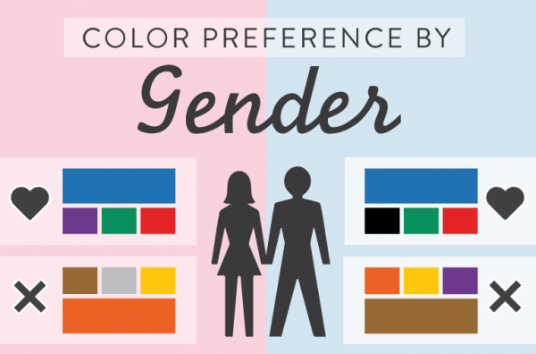
In spite of appearances, colour plays a significant role in content marketing, because owing to it we may contribute to positive emotions of users. Bear in mind that colours have different meanings in particular cultures and also watch out for different colour preferences between women and man.
Can colour directly translate to conversions?
Depending on the button’s colour, will there be more clicks on CTA (call to action) button?
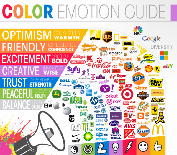
An answer to the question which colour is the most effective one is not easy, but according to research blue is accepted to the greatest extent and arouses most positive associations. On the basis of the graphics below, see how global brands use colours and check out what emotions your school’s logo is likely to arouse.

You have certainly seen more than one a website with Times New Roman font, leaflets of the same school using Georgia font, and articles at the blog written with the use of Arial font. Try to be moderate – do not use more than three font types. For example, when creating a website, choose one font for the text, another one for headers and possibly use the third one in advertising banners. Where would you get the fonts from?
Google comes again to the rescue by making available the library of free Google Fonts. This is where free fonts can be found and you do not even have to download them to your computer – it suffices to add the chosen one to the collection, select Use and click on proper styles. You can also take advantage of easy-to-use fonts at Font Squirrel.
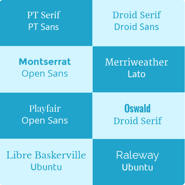
Which fonts will look well with each other?
It is best to combine fonts with the same font family. The graphics bellows present the tried and tested solutions.
|
Interesting solutions:
|

One of the most important elements is comprised by choice of the proper photo. With benefits for your wallet, more and more services offering free photos appear. But not all of them can be downloaded with impunity, and some of them hold the CC-BY licence – recognition of the copyright holder. What does it mean? Upon each copying followed by utilization of a photo, one has to place the information crediting the photo’s author.
To make the creation of graphic materials easier for you, I highlighted only those pages that offer photographs with CCo licence, which permits downloading of photos for free without the obligation to credit their respective authors.
When opting for free photos you have to remember that they will not always be of top quality and that your neighbour or any other company can use them too. So there is always an option to acquire photographs against a royalty; you can purchase them from:

To make your materials stand out, visualise data and highlight key points, apply graphic symbols, icons and shapes. Where can you find them?
- Patterns – SubtlePatterns –you will find there various patterns changing an ordinary sheet into something special.
- Icons – you can simply search an icon in Google Graphics, e.g. school icon or use the pages listed below.
IconSchock (for free after logging on to Facebook, Google+)
Modern UI icons
Flaticon (the author of a given icon has to be credited)
- A resource of vectors, icons, templetes – graphichive

Extremely useful in the designing of graphic materials, and in daily work, are the tools generating screenshots (free yourself from Print Screen and Paint). There are applications owing to which you can mark up the area you want to save and you can also pre-edit it.

You do not have to be a graphics ninja to create an interesting collage, infographics, a photo with a quote, or a meme. You can easily do that on your own using the free tools I am presenting below.
- Social media image maker – a tool enabling adjustments of photos in social media
- Photo Collages – Photovisi
- Interactive graphics – ThingLink
It is a very nice way to involve users by directing them via links
on the photos to various subpages – see an example below.

- Creation of infographics – Piktochart / easel.ly / Canva /
Wordle – creation of word clouds - Memes – MemeCenter / imgflip

- The last tool for swift downsizing of photos without any quality deterioration – Simple Image Resizer
—
Whenever you create any graphic materials, try to stick the rule of “The less and simpler, the better”. It is important not to copy somebody else’s work, but of course, it is always worthwhile to look at well-designed leaflets or graphics made by professionals and model your work on theirs. Eventually, if you are unable to create anything on your own, buy it – costs are not substantial and effects can be impressive.
If you want to see in the next post some examples of well-designed leaflets, graphics for mailings and other involving materials, let us know in the comments or write to marketing@langlion.com.